Two Obamas and a Hillary!
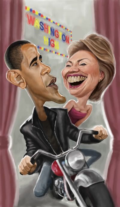 These are two illustrations I've done using mainly the same reference for Obama. I would normally avoid this at all costs, but I think as long as the results are different for each piece, it's acceptable. The reference is really just a guide for lighting, and most of the time I work from two or three references. In this case, the lighting happened to suit both compositions. The first piece above was done last year for the Radio Times, and the print size was really small, so I didn't worry too much about the detail, the key issue was fitting everything into the composition, and still have it stand out when reduced.
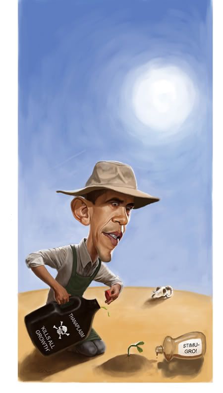 The second piece was done yesterday for the Weekly Standard, another quickie, less than 24 hrs, but this time I had the Friday night free as well, often I've had a piece to do for them on the same day as a gig, giving me even less time. So it was about 14 hrs total.
 The art director added the finishing touches to the text (see below).


Comments
Thanks guys!